Swiss Films Festival
(2024 • 5 Weeks)
Team
Bharathi Kiran Sonea, Lynnsey Ong, Ethan Allwood, Jeff Orsino
Role
Visual Identity, Art Direction


Introducing Swiss Filmmaking to an International Audience.
Highlighting the achievements of staff working behind the scenes within the Swiss Film Industry, we aim to increase exposure for both the film and crew on a global scale. Utilizing a distinctive visual identity that appeals to the audiences, while also informing them of the Swiss Films Festival through sneak peaks + previews of the film catalogue list creates an accessible avenue for more audiences to experience Swiss filmmaking.
↳ the client.
Key insights from secondary research:
“We work together with international film institutions to help Swiss filmmakers achieve global visibility — through curated programmes, retrospectives and special events.”
— Film Programmes section of Swiss Films
“Garnering attention for Swiss films and connecting filmmakers — that is what we set out to do at international festivals and film markets.”
— Presence at Festivals and Markets section of Swiss Films
"How might we leverage the compelling qualities of the production team through an immersive experience in order to foster future collaboration?"
↳ framing the problem to design an appropriate solution.
↳ surfacing content through image and video sneak peaks, enticing curiosity.
This approach adopts a pre-event experience. The goal was to focus on the splendor of each artist through tone, leveraging the achievements of their movies to entice future collaborators to get to know the person and connect. The immersive environment is created by allowing visitors to explore a grid of images to discover new content underneath.
Highlighting the achievements of staff working behind the scenes within the Swiss film industry, we aim to increase exposure for both the film and crew on a global scale. Utilizing a distinct visual identity that appeals to the audiences, while also informing them of the Swiss Films Festival through sneak peaks +previews of the film catalogue list creates an accessible avenue for more audiences to experience Swiss filmmaking.
Glorifying the members behind the scenes to emphasize their achievements and help build connections between filmmakers.

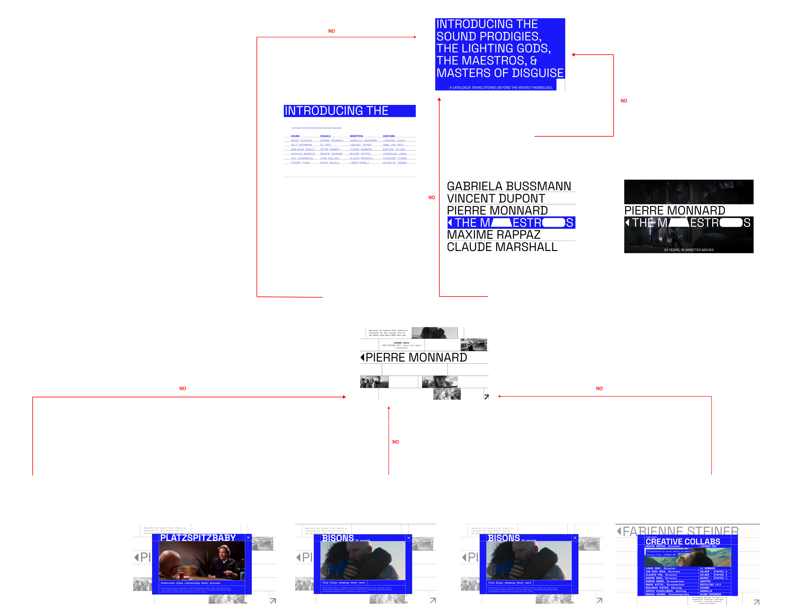
The crew members are categorized in ways that add to their splendour. Directors, Producers, and Writers are called 'Maestros', but Music and Sound Effects Editors are 'Sound Prodigies'. Scrolling down the landing page leads to an alternative navigation that offers a more functional way of navigating the same content.
Featuring: The Maestros.
Clicking on a category leads to a list of associated names which, upon hover, offers a sneak peek of their work as a full bleed video. For this category, we specifically showcase the films that directors, producers and writers worked on. It also uses an impactful one liner to highlight a significant fact about them.
Discovering the Grid [1]: Creative Collaboration.
Across all categories, hovering on an image highlights their achievements to reinforce the sense of grandeur and indicates the type of content it leads to before clicking. Each image contains information unique to each crew member, segmented in 2 groups: design process and creative collaborations which when clicked, leads to a pop-up. “Creative Collabs”, here, is a showcase of the big names they worked with and in what way to show their versatility across roles and teams.
Discovering the Grid [2]: Process Page.
The process page will look different for each person. Since maestros have a more prominent presence in the creation of the story, they are more likely to have interviews, which are a form of communicating processes and intent. Other ways might include breaking down scripts and stills and understanding the variance in the art of storytelling for each director, producer, and writer.
Featuring: The Sound Prodigies.
For sound prodigies, the hover states highlights how they work with sound. Process looks different across crew members. We focus on how the sound editors recreate sounds, choose music or edit them. A peek at their creative process lets the visitor in on their thought processes when executing a maestro’s creative vision. The process video explains the choices made for certain effects.
Featuring: The Visual Virtuosos
In this category, the creative processes can range from how a gaffer utilizes lighting or how a videographer handles a camera. In our example, we choose film stills to highlight cinematographers on the list. Their individual pages offer a detailed explanation on how cinematographers approach a movie, set the mood, choose their material and how they bring their vision to life.
Featuring: The Masters of Disguise.
As visitors hover on the names, again, a quick video will play, this time highlighting how the costume designers and makeup artists work with material. Process-wise, we look at how they approach ideas, their stylistic choices and how they apply their work on actors as it shows their creative process to achieve the look the movie needs.
Learning from past precedents to guide the creation of an art direction for the microsite.
I led the development of our art direction through an intensive graphic experimentation week, resulting in graphic assets that helped guide the creation of our microsite. I also assisted in developing the interaction design for the microsite, iterating on animations to create a more immersive and engaging experience for visitors of the site.
Karel Martens | Design Precedent
Studying Karel Martens’ design work for the OASE Magazine to gain insights on design techniques that he uses, and developing our insights into graphic qualities that we can use to create our own visual identity for the Swiss Films Festival. I experimented with the repetition of letterforms to create blocks that help establish visual hierarchy of information.
01. Repetition of letterforms to create blocks of shape.
02. Using texture from layering text to create visual tension.
03. Emphasis of content through varying visual opacities.
Ellen Lupton | Design How To's
Learning from Ellen Lupton’s teachings with design principles, I used ‘point, line, and plane’ as physical guides to help direct visual flow. This was reinforced with Gestalt’s principle of similarity to allow separation of content into smaller, digestible clusters to avoid information overload and visual fatigue. Cohesion of content is retained through association by proximity + scale.
01. Continuity to diagonally slice images and reveal content.
02. Lines as physical guides to compartmentalize information.
↳ my role in the project.
Exploring different lines of graphic investigations to develop a visual identity.
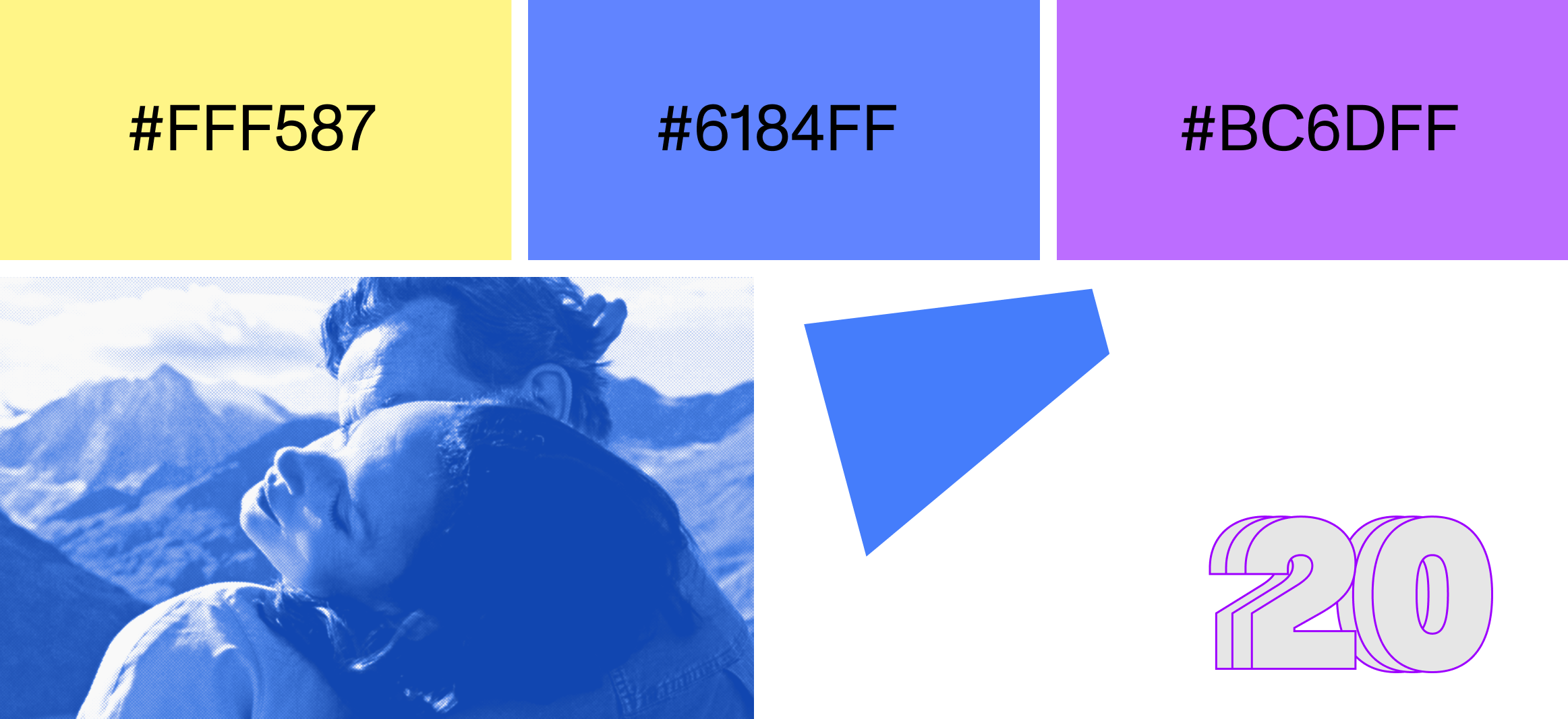
ABC Monument Grotesk Mono + GT Pressura Mono
ABC Monument Grotesk Mono and GT Pressura Mono were chosen because their monospaced properties allows for a straight clean left align compare to other typefaces, creating uniform shapes that align well in a composition that deals with irregular smudges.
Color + Image Treatment
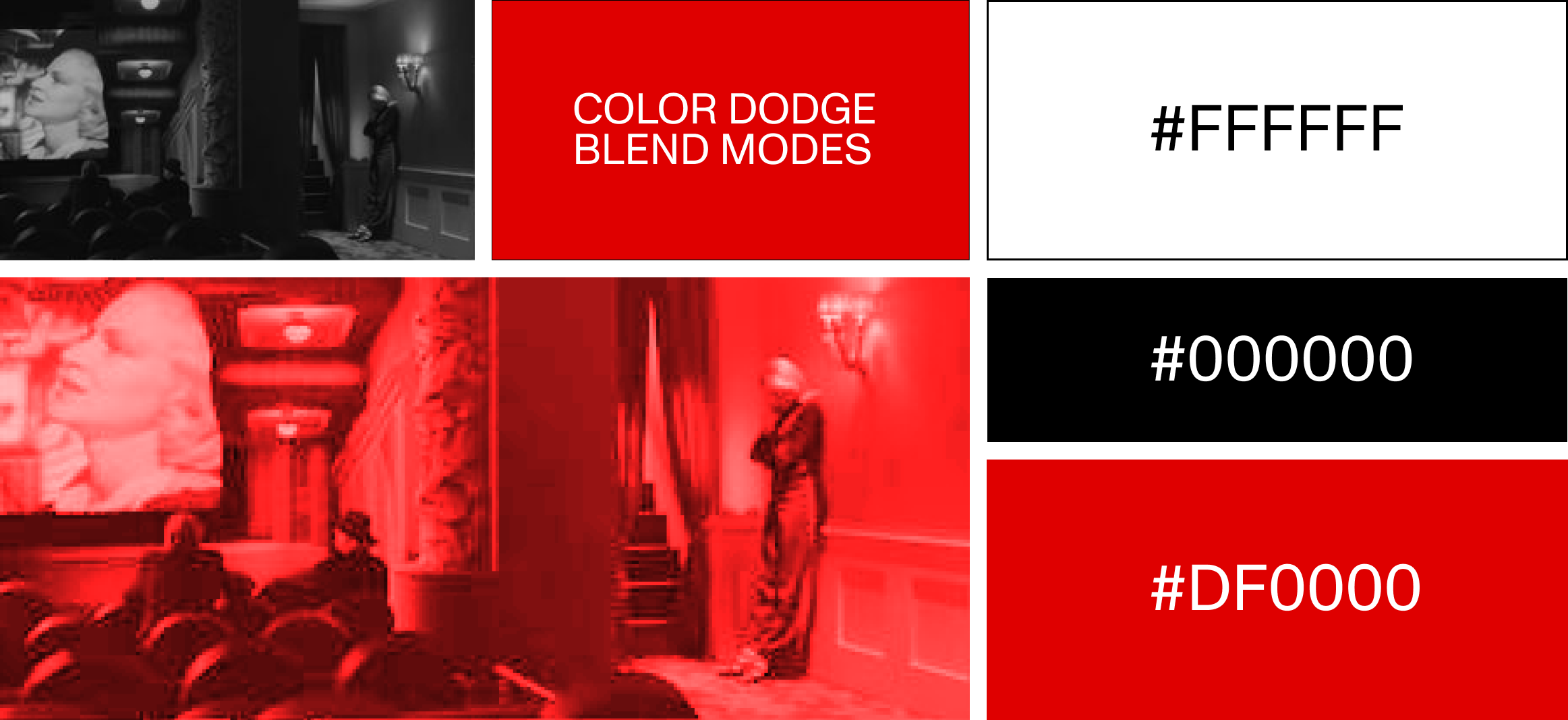
The smudges and background text were colored red to provide a strong contrast against the black and white. It guides the viewer through the composition because it’s brightness draws the viewer in first.
The image is treated both in red using color dodge and color burn. Color burn is used to create the smudge but color dodge specifically treats the image to support the smudging effect.
01: Type textures + Overlays + Lines as guides.

PP Agrandir + GT Flexa Mono
A rounded and black heavy weight of PP Agrandir is used to match the properties of the image frame shapes. GT Flexa Mono is used to create compact monospace clusters as texture to the images, also providing a contrast against the title.
Color + Image Treatment

The theme in this line revolves around greyscales and muted colours to allow for the darker areas to pop out for example the black text and the black areas of the images.
The greyscale image treatment allows the subjects in each image to become more prominent whether they are darker against a light background, and vice versa.
02: Framing + Type as texture.
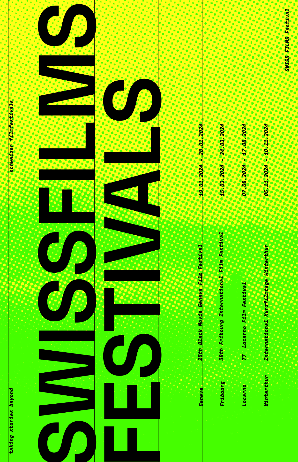
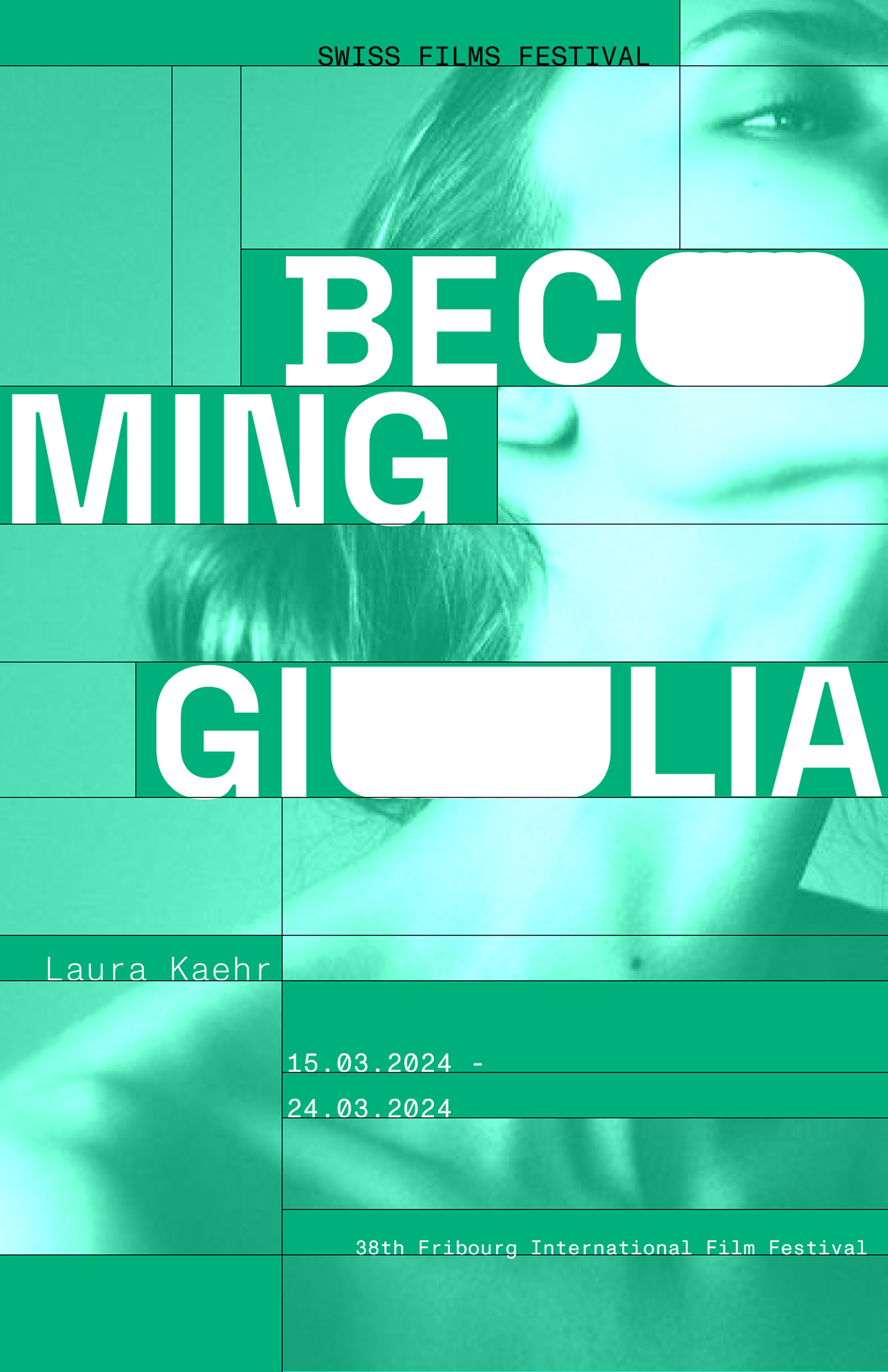
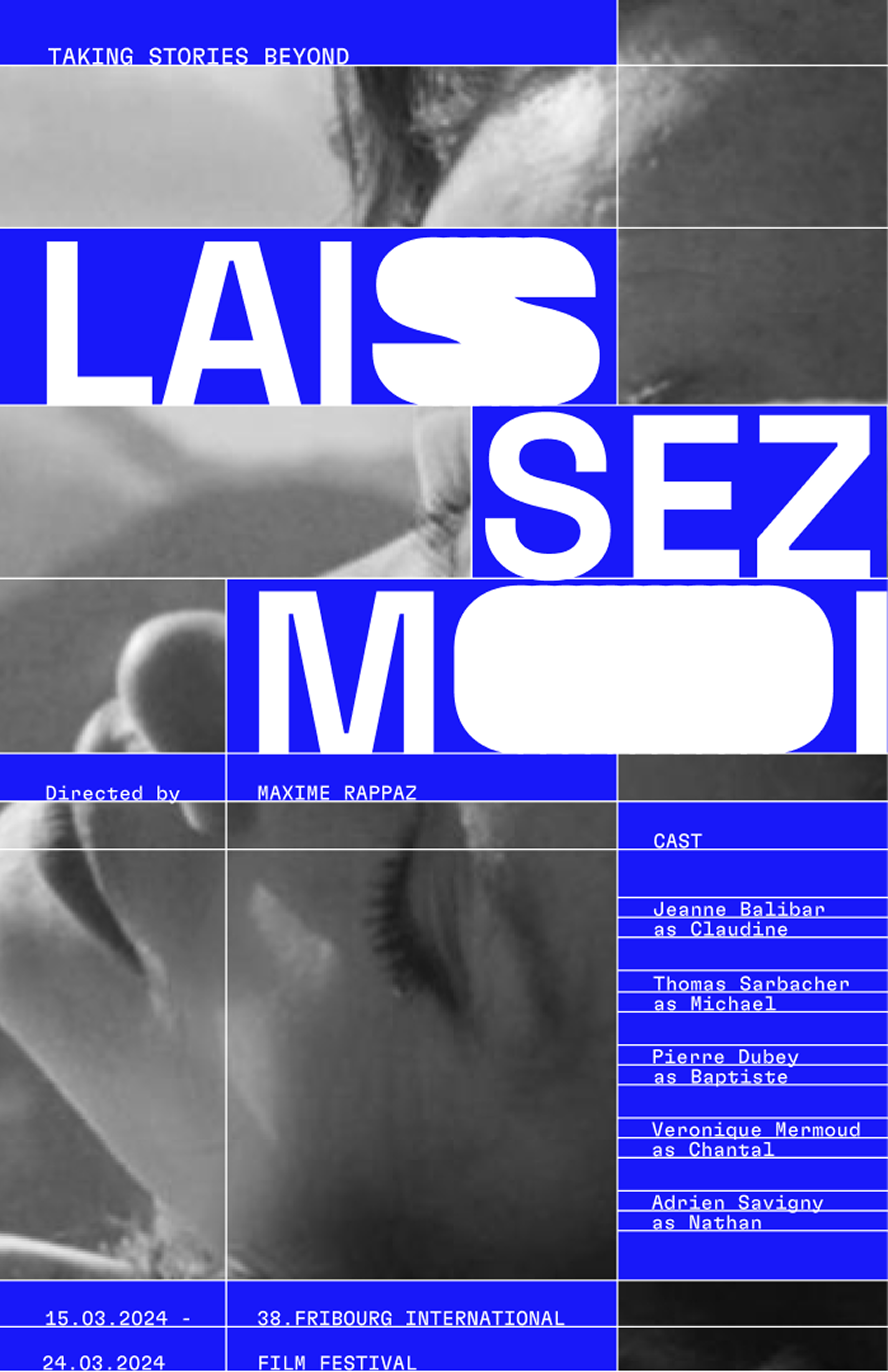
Space Grotesk + Monument Grotesk Mono
Monument Grotesk Mono as a body text complements the sans serif Space Grotesk because the shape of the letters contain similar elements. The monospaced letters’ legibility is preserved at small scales and the edges of Space Grotesk create an interesting variation of the blocks when layered.
Color + Image Treatment
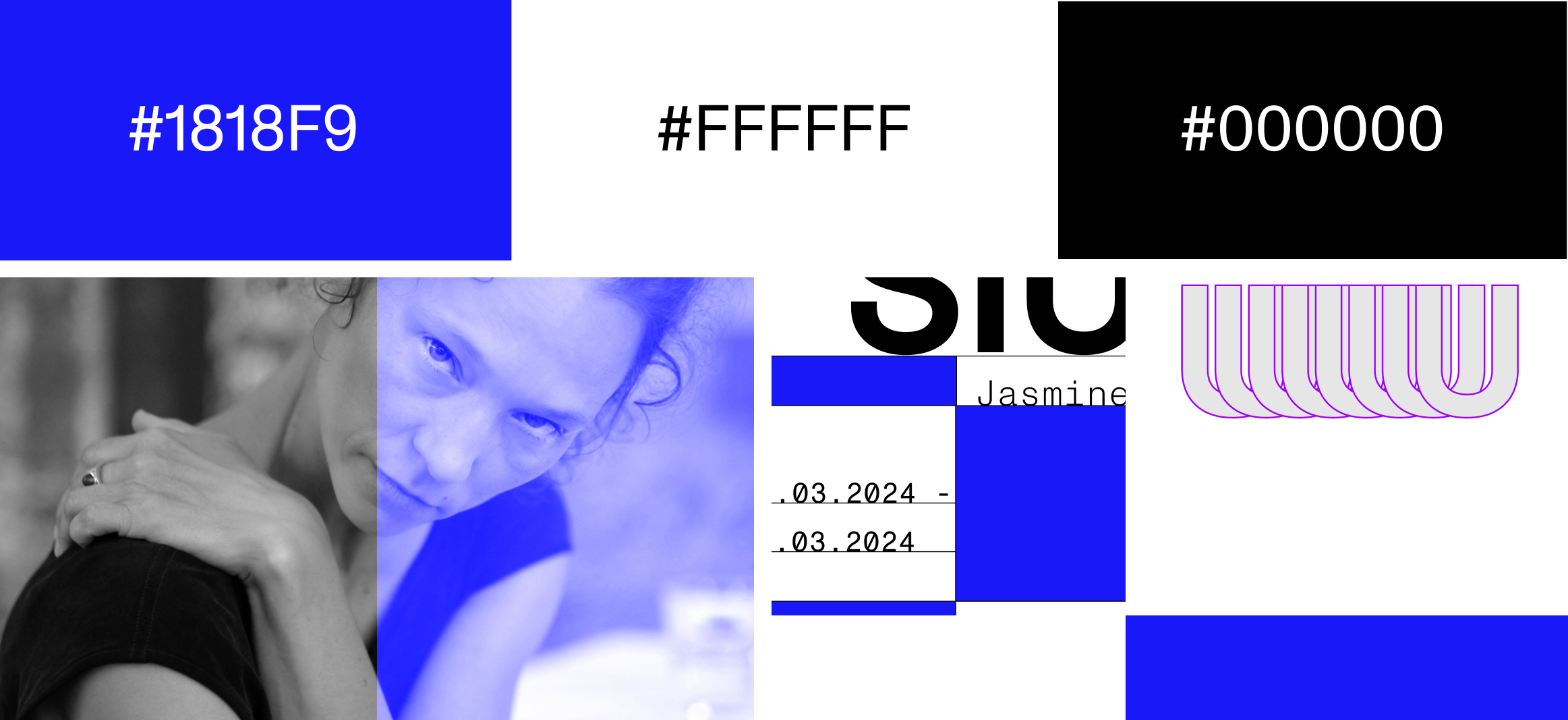
This blue created a visceral appeal because of the brightness and the texture. The black is used only for the guiding lines in small amounts but the white block draws the eyes into the text, which against the saturated blue, is striking.
The theme in this line of investigation revolves around greyscales and muted colours to allow for darker areas to pop out such as the black text and the black areas of the images.
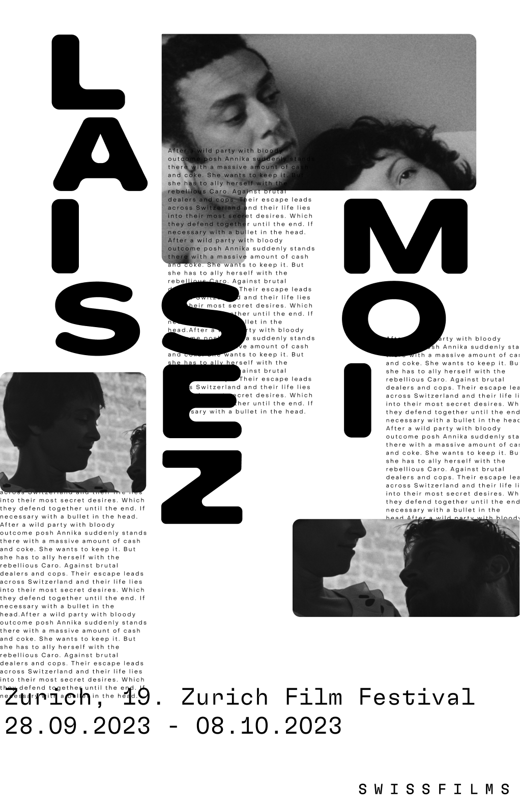
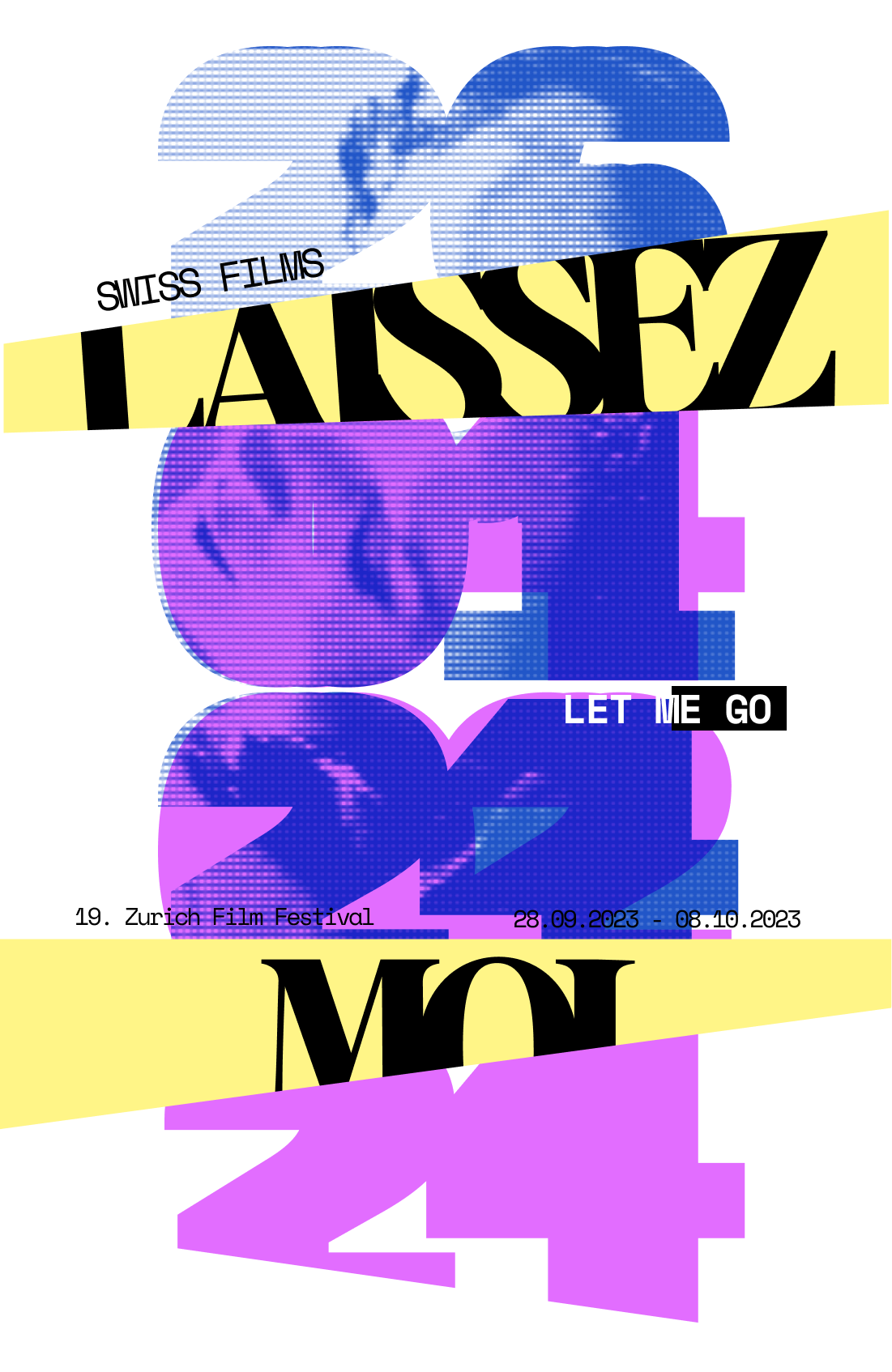
03: Lines as guides + Layering type.

EDITOR'S Note + GT Flexa Mono
A heavy sans serif font, Editor’s Note, were used in a bigger scale and a straight clean font, GT Flexa Mono, was used because both types heavily contrast each other. Editor’s Note works as a title because it is thicker and draws the audience’s attention more strongly while the monospaced creates clear lines when stacked horizontally.
Color + Image Treatment
The image is treated with a subtle blue halftone to soften the image while providing contrast against the hard edges of the diagonals. It complements the chosen colour palette allowing the white and black text to pop.
04: Layering type + Continuity + Overlays.
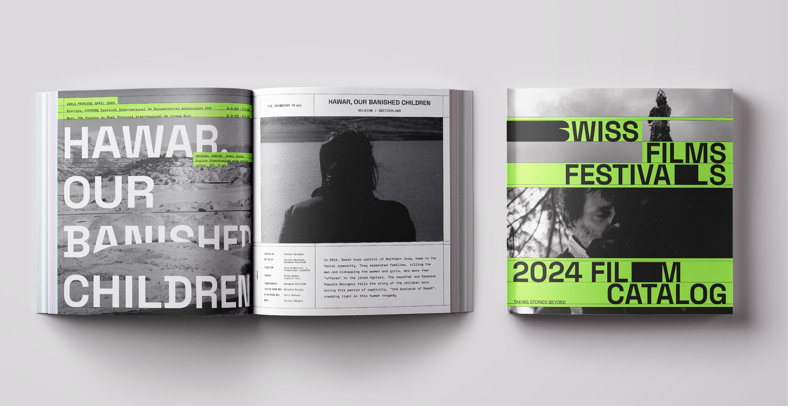
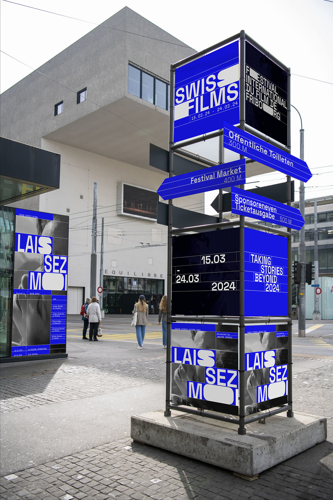
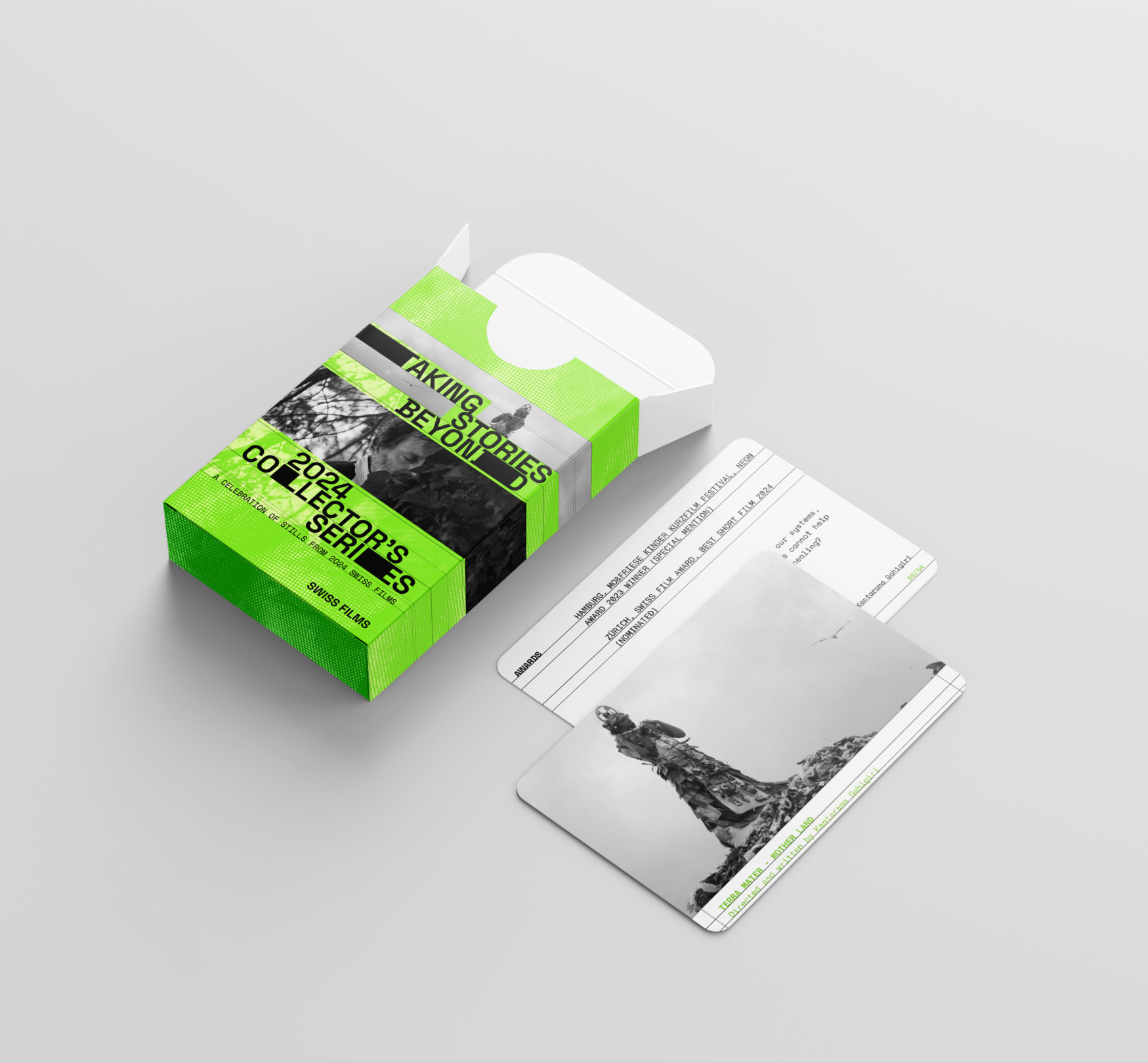
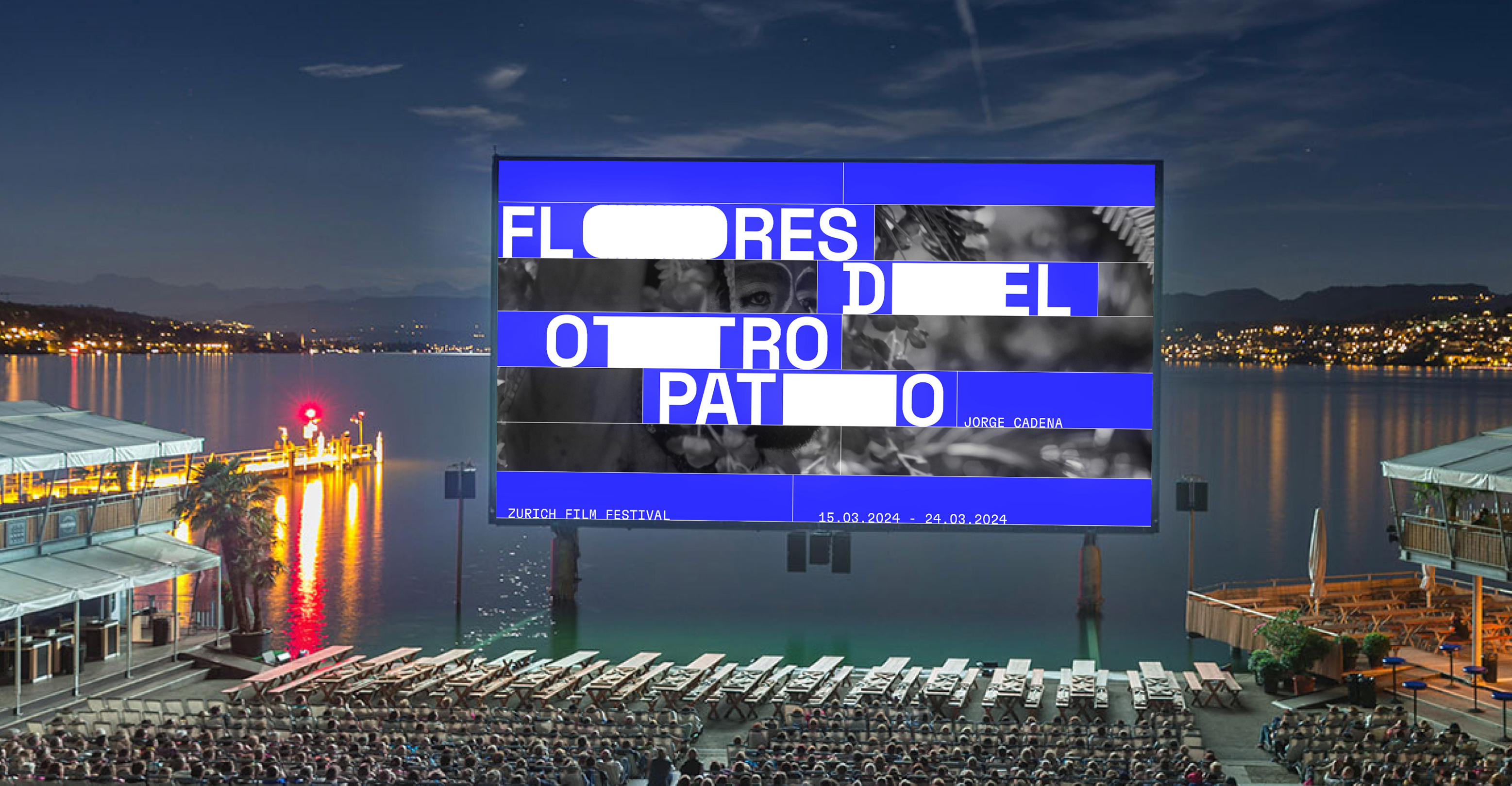
The third line of experimentation was chosen for the flexibility of the visual direction, allowing for flexible use of grids as informational compartments to reduce cognitive load and for visual balance afforded by the blocked letterforms. This creates a visual flow that both clearly informs and visually guides viewers throughout the designs.
↳ final art direction.
Week 1.5
Using lines to compartmentalize information and experimenting with typography and color usage.
Week 2
First attempt at integrating images into our art direction, utilizing the rich and vivid imagery from the festival.
Week 3
Developing the visual identity to be more stripped down, focusing on content and imagery of featured films to highlight their core messages.
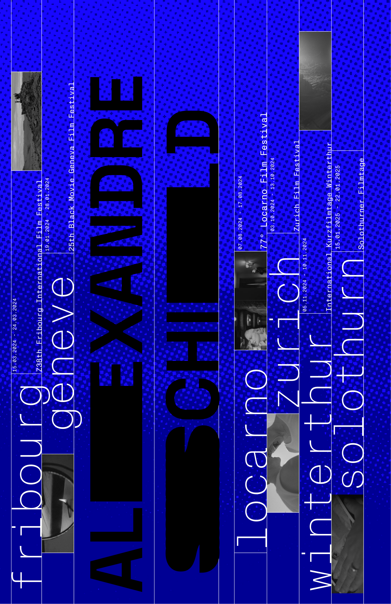
Space Grotesk + GT Flexa Mono
GT Flexa Mono complements the sans serif Space Grotesk because the shape of the letters contain similar monospace qualities. The monospace is clear at small scales and the edges of Space Grotesk create an interesting variation of the blocks when layered.
Color + Image Treatment
A monochromatic color palette was used for a visceral appeal using bright blue. The black is used for contrast and guiding lines. The white blocks draw the eyes to the text which, with the saturated blue, is striking.
Week 05

I learned the importance of supporting my design decisions with data from research, providing a rationale for why my designs are the way they are. This project helped me understand how to create meaningful design for people, putting them at the forefront of the design, and letting their needs drive the process in developing the final form of the designs.
My main takeaway from this project would be to keep asking questions, always keeping in mind the "why" when designing, being clear on the purpose of my design, and for "who" I am making my design — this creates a more informed design both in terms of the visual design and the way content are presented to viewers.
The fast pace that came with the 5-week timeline to complete this project helped myself learn to let go of past ideas, acknowledging the fact that our work can never truly be "perfect" — this helped in learning to be content with the state of my design being "good enough" to move on. This decisiveness allowed myself to focus on specific art directions which I believe held more promise in terms of further exploring graphically, giving more time to experiment with different graphic assets to help guide the project's art direction and creating a visual identity.
This was one of the toughest projects that I ever did, with constant pivots and iterations that needed to be carried out but it was certainly one of the most rewarding projects. I gained more confidence in myself as a designer and learned to be bolder in what I do, taking ownership of my work.
↳ reflection.
